
Consider This
Author: Chuck Palahniuk
Designer: Tree Abraham
Creative Director: Albert Tang
Publisher: Grand Central Publishing
Designer: Tree Abraham
Creative Director: Albert Tang
Publisher: Grand Central Publishing
How did you become a book designer?
I did my design degree in the UK and had a strong sense before starting that book design was where I wanted to land. I remember David Pearson coming to speak to our class and vehemently nodding along to his perspective on the allure of the format and its history. It felt like the ideal combination of experimental illustration and conceptual problem solving, culminating in an enduring and essential object. Throughout my degree, I sought internships in studios focused on book design and in publishing houses in London, while also setting myself cover briefs to build a portfolio. My first cover commissions began before graduation. A couple of months after graduation, following hundreds of e-mails to people in publishing in North America, I got a junior design position at Abrams Books in New York, and many more ongoing freelance partnerships. There was nothing accidental about the path, it was all persistent making and networking.
What's the book about / What were any constraints?
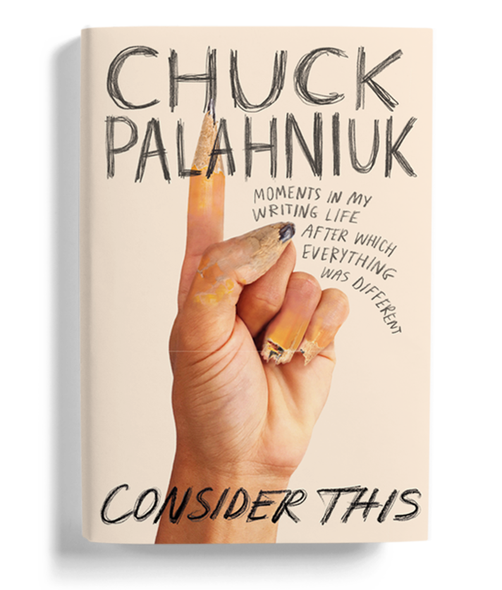
Consider This is part writing guide part writer’s memoir from the acclaimed novelist Chuck Palahniuk. Palahniuk offers snapshots from his evolution as an author alongside cutting insights on his process from big ideas to choice wording.
This was the first book Grand Central acquired of Palahniuk’s, so everyone was eager to ensure continuity of his edgy aesthetic. I believe my creative director’s only request was to make a fucking-weird-awesome-never-been-seen-before-best-cover-ever—so, no pressure.
What did your design process entail?
As a nascent writer myself, I had recently read a bunch of the most popular writing guides when I received the Consider This manuscript. For me, it sticks out from the others with a brazen confidence, actionable tips, and quirky vantage point that changed how I thought about the reader’s reception of the work. While other guides’ covers seem to have focused on graphic devices pertaining to words on a page, I felt this cover was more about the person behind the writing.
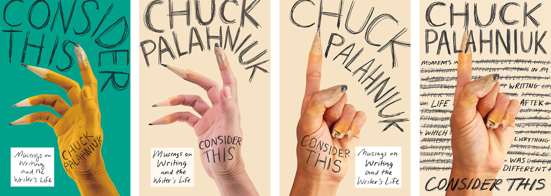
There is a passage in the book that reads “Your body is a recording device more effective than your mind”. I thought about how gnarly the writing process is—how the writer must wring out their senses, their memory, every visceral emotion and overlooked detail—when attempting to make the page palpable. I wanted to create a cover that nodded at the torturous yet inevitable relationship of the writer to their craft. The idea of fingers as pencils sprung out of this intention. Pencils are so impressionable. They can be chewed, broken, sharpened down to nubs. They also leave an impression, whether faint or carving deeply, betraying the mentality of the creator who holds one. In-house the image freaked people out. Success!
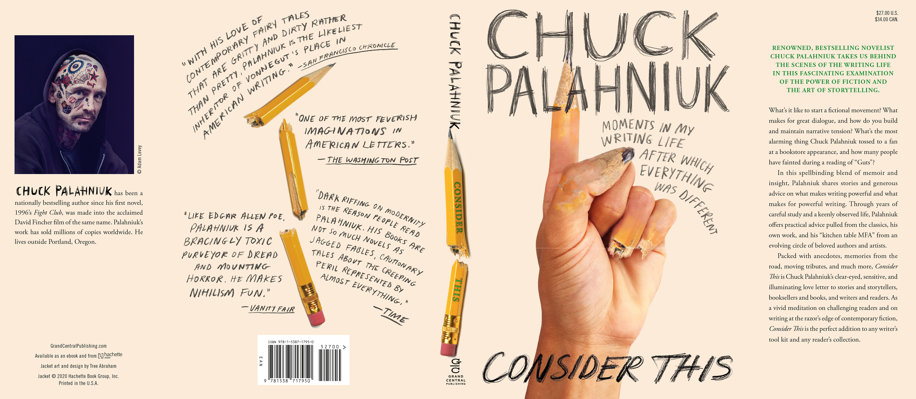
There were tweaks from the initial rough: trying different positions of the hand, integration of all copy into assertively penciled lettering, color variations (should the hand be the color of the pencil or the pencil, the color of the hand?).
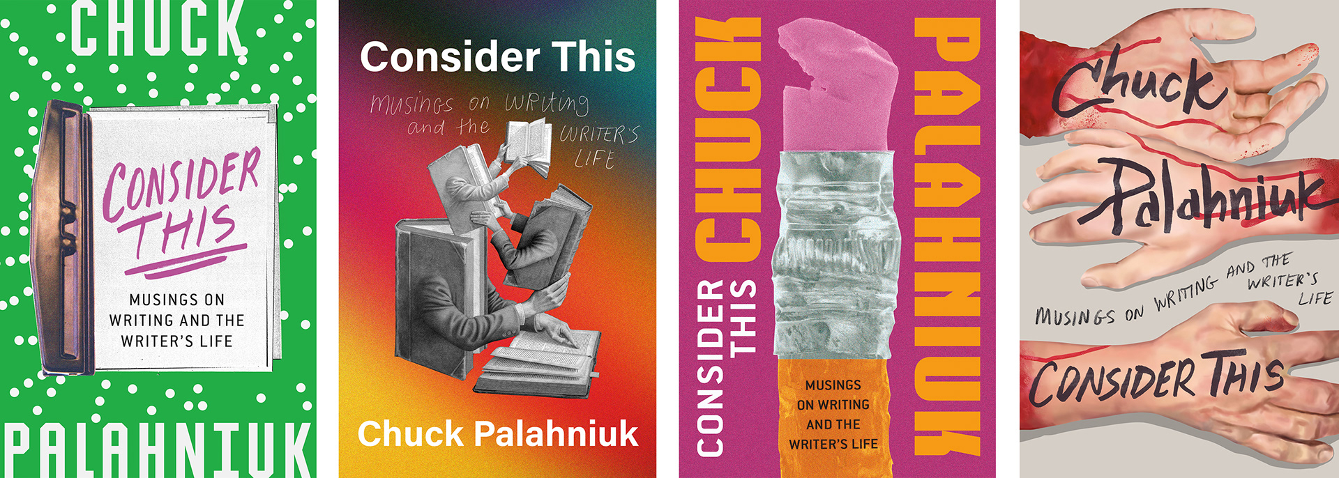
Of course, other cover options were also progressed simultaneously. My favorite killed cover was one featuring bloody dismembered arms. These are replicas of the fake limbs Palahniuk signs and gives out at his book launches. He started using them to thwart further tattooing of his autograph by fans on their bodies, which had become a trend. Both the final and killed cover required a lot of Photoshop work. The final cover is a composite of stock photographs of a hand and of broken pencils. The killed cover is completely illustrated with digital brushes then overlaid with Sharpie-drawn type to mimic Palahniuk’s handwriting. Since most of my work tends toward analog image-making, I was giddy delving into digital tools to realistic ends.
What's something unique you learned while working on this project?
I don’t usually get asked to design covers for long-running bestselling authors with established identities and followings. I thought my roots in designing literary non-fiction and female memoir might have limited my scope of outcomes. But oddly, being asked to embody such an outrageous intensity was a new but not foreign challenge. It seems with every book the designer is asked to step into the skin of an entirely different human. I discovered through designing this book and the subsequent Palahniuk novel The Invention of Sound how addictive it can be to seek out increasingly unexplored skins and how easy it can be to find a compatriot at their cores.

Tree Abraham is a book designer for publishers in Canada (where she’s from), the UK (where she studied), and the US (where she lives). She is currently a senior designer at Grand Central Publishing in New York. Her best ideas come while swimming or reading the dictionary. When not designing, she can be found traveling to unmarked places, digging in dirt, and writing unsolicited manuscripts.