
Hap & Hazard and the
End of the World
End of the World
How did you become a book cover designer? What do you enjoy about your job?
A little over a year after graduating art school, I was given the chance to get my foot in the door at HarperCollins working on young adult covers. It was a fantastic opportunity to learn the ropes with a really talented team. Eventually I moved to adult trade at Simon & Schuster and after a couple of years there, I moved into freelance book cover design for about 10 years. Working in cover design ticks a lot of boxes for me. I get the chance to read some really great books, and the challenge of boiling a few hundred pages into one visual cover is really satisfying. It lets me try on a lot of different hats. From hand lettering, to illustration, to photography, cover design never gets boring.
Specifications:
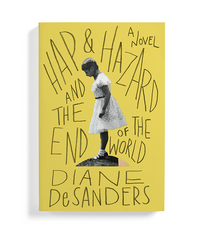
Hap & Hazard and the End of the World was a title I worked on for Bellevue Literary Press. The type is all hand lettered and the image was actually from the author. I believe it’s a picture of her even though this isn’t a memoir.
Genre:
This title fits into the literary world of coming of age stories. It’s set in post WW2 middle America and shows an intimate look at the struggles of family life from the view point of the oldest daughter who, from what I remember, is around 7 years old. The father is dealing with PTSD after coming back from war. There’s domestic abuse and the pressures of the era for mothers and women in general. I liked that while there are very specific details to the family, the father’s name is Dick, and the mother is Jane. We never find out the daughter’s name.
Process:
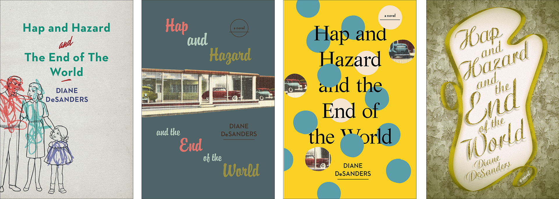
One thing I love collecting is old linen postcards. And a lot of the ones I have are from this era. So as I was reading, I was hoping to find some sort of imagery in the novel that I had in my stack of postcards. The father in the story runs a car dealership, so I started to look for old postcards promoting old dealerships from the time period. There was also mention of certain games popular in the post war years. Marbles was one, so had fun creating a water color illustration of marbles.
We went a few rounds exploring different experiences of that era like drive in movies and film opening title cards. Then the author came back to us with some personal family photographs. There was this one with the girl standing over some pet rabbits. I think the girl in the photo is the author. There was something in the posture once collaged out of the original photo that felt like she was standing on a dangerous edge looking in to a world she was trying to understand. Just the way her hand is sort of pulled back and a one foot inching just slightly in front of the other felt like the voice of the girl in the novel. But the fact that the image is just slightly out of focus felt right with how anonymous the girl is. I liked having her surrounded by chaotic lettering almost closing in on her. Sort of like the voices of the adults in her life.
Specifications:
Hap & Hazard and the End of the World was a title I worked on for Bellevue Literary Press. The type is all hand lettered and the image was actually from the author. I believe it’s a picture of her even though this isn’t a memoir.
Genre:
This title fits into the literary world of coming of age stories. It’s set in post WW2 middle America and shows an intimate look at the struggles of family life from the view point of the oldest daughter who, from what I remember, is around 7 years old. The father is dealing with PTSD after coming back from war. There’s domestic abuse and the pressures of the era for mothers and women in general. I liked that while there are very specific details to the family, the father’s name is Dick, and the mother is Jane. We never find out the daughter’s name.
Process:
One thing I love collecting is old linen postcards. And a lot of the ones I have are from this era. So as I was reading, I was hoping to find some sort of imagery in the novel that I had in my stack of postcards. The father in the story runs a car dealership, so I started to look for old postcards promoting old dealerships from the time period. There was also mention of certain games popular in the post war years. Marbles was one, so had fun creating a water color illustration of marbles.
We went a few rounds exploring different experiences of that era like drive in movies and film opening title cards. Then the author came back to us with some personal family photographs. There was this one with the girl standing over some pet rabbits. I think the girl in the photo is the author. There was something in the posture once collaged out of the original photo that felt like she was standing on a dangerous edge looking in to a world she was trying to understand. Just the way her hand is sort of pulled back and a one foot inching just slightly in front of the other felt like the voice of the girl in the novel. But the fact that the image is just slightly out of focus felt right with how anonymous the girl is. I liked having her surrounded by chaotic lettering almost closing in on her. Sort of like the voices of the adults in her life.
Rejected cover comps for Hap & Hazard and the End of the World, and provided author photo that was used in the final cover design:

Jen Heuer is a graphic designer and illustrator working out of the Pencil Factory in Brooklyn NY. She has been featured in 50 Books/50 Covers and various other publications including Print Magazine. Learn more about Jen’s process and work in this Faceout Books interview, this Casual Optimist interview and this podcast interview with Sam Weber. The cover process for A House in the Sky was featured in the New York Times' Art Beat "Before & After". She's been selected in a New York Times' Notable Opinion Art of the Year.
Read her piece about women in book design on LitHub's blog.
Jen is a visiting professor in Pratt Institute's ComD department, where she was a graduate.