
How did you become a book cover designer?
From an early age, I wanted to become a writer (still do), and began submitting my work to journals and magazines in my twenties. In the process, I came to love the form of the literary journal. So, in 2008, I decided to start my own. I didn’t know anything about graphic design, and didn’t know any designers. But, over the course of a year or so, I taught myself enough to put together a first issue. Later, I began slowly picking up typesetting and design jobs here and there from contacts I’d made through the magazine and things progressed from there. By 2014 I was doing sufficiently well enough to quit my day job as a line cook.
What do you enjoy about your job?
I love that I’m always learning, continually stretching myself creatively and technically. Each project forces me to think about a subject in ways that I wouldn’t likely have otherwise. In this way, the practice remains fresh and new avenues of inspiration are constantly opening up. Design is often largely intuitive—the process itself often dictating where you end up. Oftentimes when I think I have a pretty clear concept in mind, the moment I begin drafting, it immediately becomes something else entirely. There can be a lot of pleasure in the serendipitousness of it.
Who is the publisher?
Bellevue Literary Press.
What are the typefaces being used?
Aphasia and Alternate Gothic.
Where are the images from?
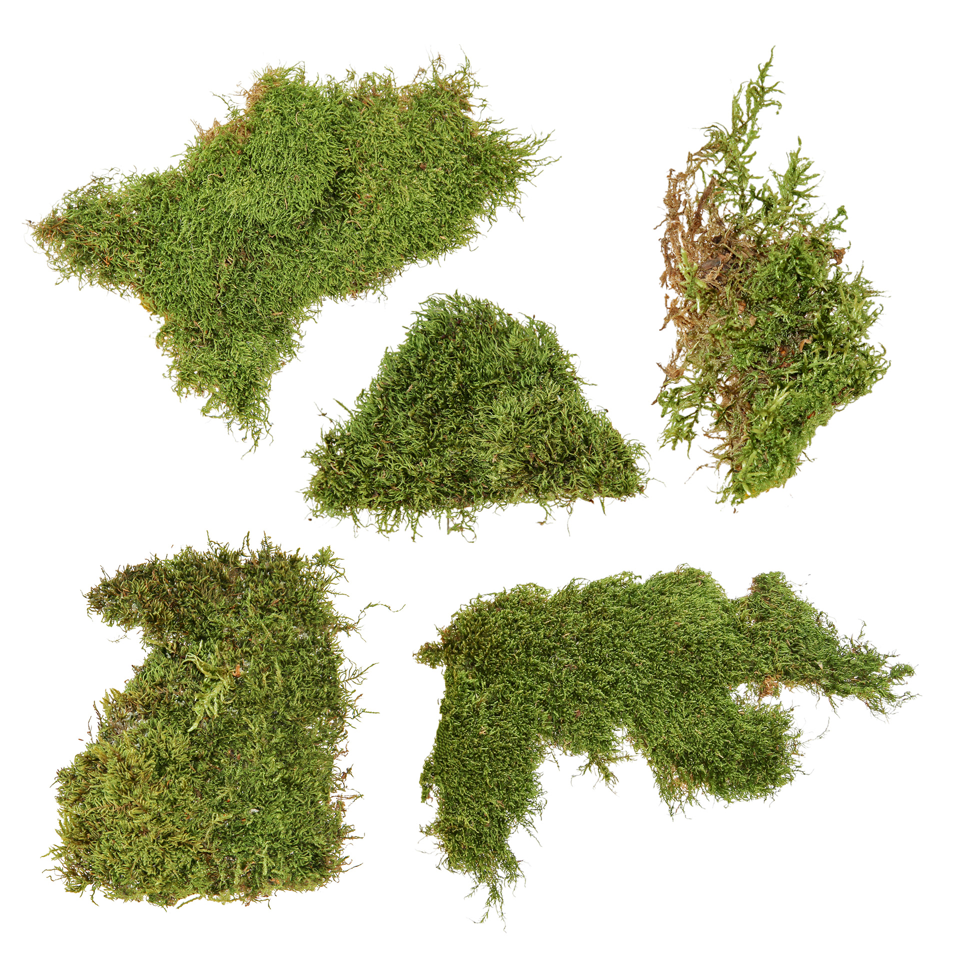
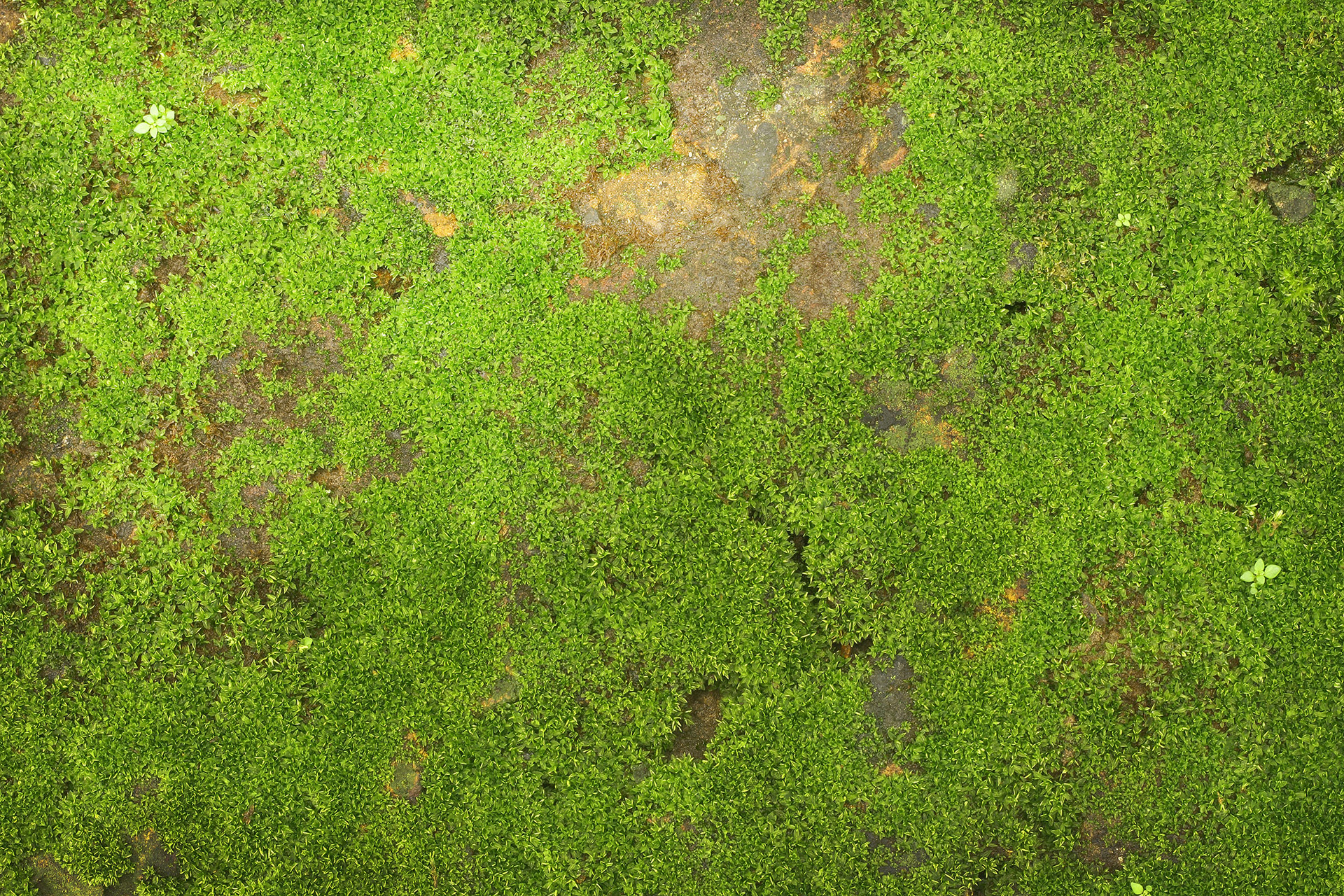
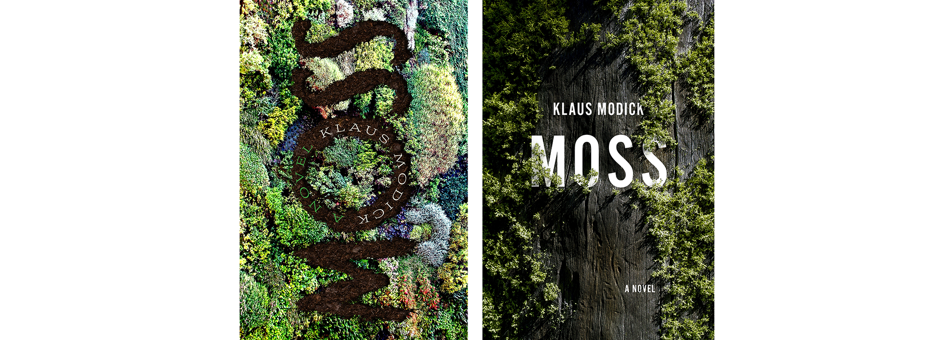
The moss elements are iStock.
What is the genre/audience?
Literary fiction/ecofiction.
What is the book about?
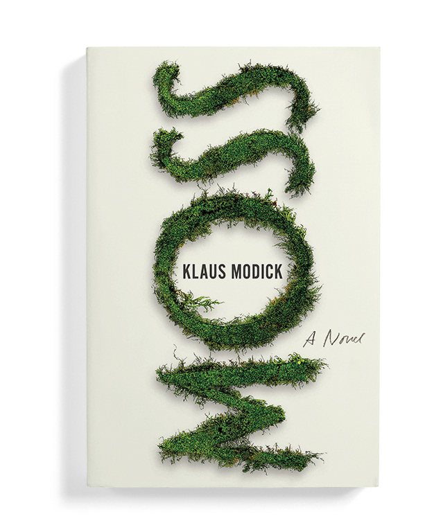
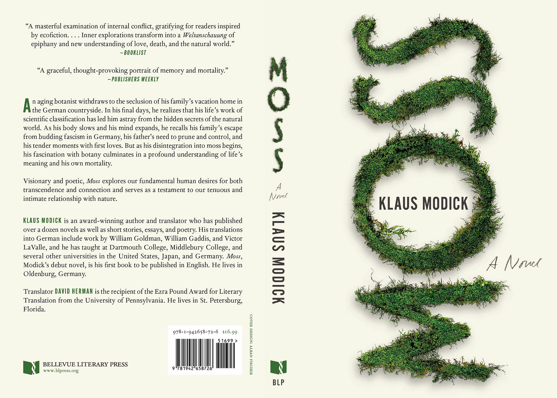
Moss is a lyrical novel about an aging botanist, dying of heart disease at his family’s summer house in the German countryside. In his last days, as he disintegrates into the moss he muses on, he’s drawn back into his memories of childhood and young adulthood, remembering his harsh father, his family’s escape from budding fascism, as well as his first youthful loves. Ultimately, it’s about our true connection—the interconnectedness of all beings—to the natural world.
Were there any constraints from the client?
In the project brief, the client mentioned that “I can envision the title peeking out from a profusion of moss, exploding with green so lush that the book is irresistible to pick up. A more understated botanical drawing could also work, as long as it doesn’t look too precious. Or moss as the typeface.” After a few creative dead ends—particularly with botanical images (I wanted to resist the trend of the type-interweaved-with-botanicals cover)—the bit about “moss as typeface” ultimately set me off in the right direction. I arranged the type vertically to draw the eye upward and further evoke growth and transcendence, inserted an image of moss into the letterforms, then carefully pasted in fragments from other moss images around the edges, messed with the levels to balance the colors, then added some posterization and shadows. It took quite a while and was a lot of close work, obviously, but it was exciting to achieve such a realistic look in the end. Although it’s relatively spare, I think it achieves the lushness the client was asking for as well.
Rejected cover comps for Moss:

Alban Fisher is the author of the poetry collection Fake Moon (The Magnificent Field, 2020) and founding editor of Trnsfr and Trnsfr Books. He has designed over 350 books, and worked with more than sixty organizations, including 826CHI, Alice James Books, The Believer, Coffee House Press, Levine Querido, Open Letter Books, Turtle Point Press, and Verso. His work has been included in the AUPresses Book, Jacket, and Journal Show, selected for AIGA and Design Observer ’s 50 Books/50 Covers, and has been recognized by The Book Cover Archive, The Casual Optimist, and Spine magazine. He lives in Grand Rapids, Michigan, where he serves as Graphic Designer for YesYes Books and Art Director of Sarabande Books.