
Pizza Girl
What do you enjoy about your job?
My creative director gives me a lot of space, and I feel supported when I present covers or directions. Doubleday’s list is expansive and includes a ton of literary fiction as well as serious non-fiction and commercial books. I also feel fortunate to design covers for our other department imprints--Knopf, Pantheon, and Vintage/Anchor paperbacks--and so I am always feeling challenged and inspired by the books and my talented co-workers.
What is the book about?
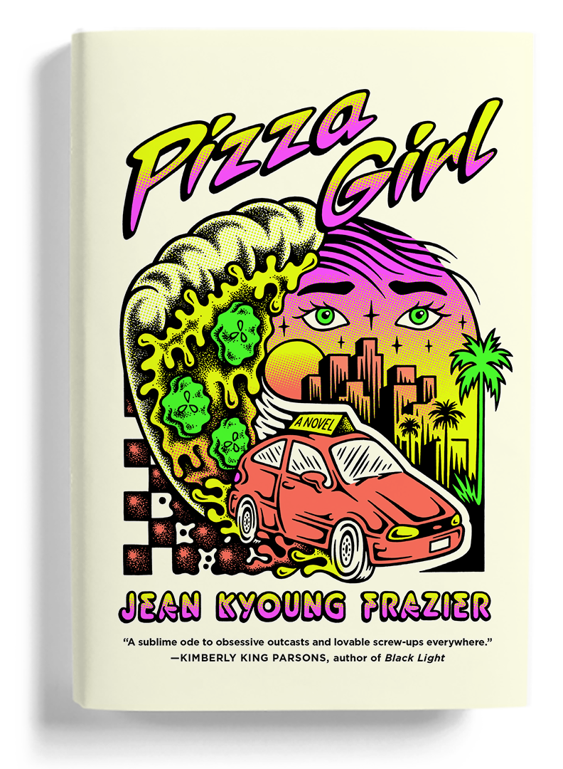
This is a coming-of-age story of an eighteen-year-old pregnant pizza delivery girl in Los Angeles, who becomes obsessed with one of her customers. She’s grieving the death of her father (who she has more in common with than she’d like to admit), avoiding her supportive mom and loving boyfriend, and ignoring her future. Her world is further upended when she becomes obsessed with Jenny, a stay-at-home mom new to the neighborhood, who comes to depend on weekly deliveries of pickled covered pizzas for her son’s happiness.
Were there any steps taken before you starting designing?
This book happens to have an amazing title. Jean, the author, is very young and in touch with what’s happening in the world. She had this great Roberta’s Pizza t-shirt, and the editor presented that along with other visuals for our first cover meeting. I had already been envisioning this cover as a sort of logo or emblem instead of a more traditional illustration, given the content and title. I loved the kind of psychedelic/punk-rock style on that t-shirt design and did some digging around to find out who the illustrator was. I found Tallboy aka Chris Coulon and checked out his work, which consists of a lot of bright neon skater art with skeletons, monkeys, eyeballs and....pizza! We showed the work to the author and she said “Um WHAT. Love love the idea, his shit is so cool and I have to stop myself from buying every design of his.”
Did you collaborate with anyone? How was that process?
So, I hired Tallboy. We talked about direction and I gave him some rough ideas as to what I was thinking, and what I felt the cover could include–pizza with pickles (a must), the beat-up red Ford Fiesta that the protagonist drives, no pregnant girl but maybe just her head/eyes, title in script, author’s name maybe a different sans serif font, and integrating ‘a novel’ into maybe the sign on top of the car. Also, (not that Tallboy needed coaching on this) but I wanted to make sure we had some really bright neon colors along with black on a white or light-colored background so they’d really pop!
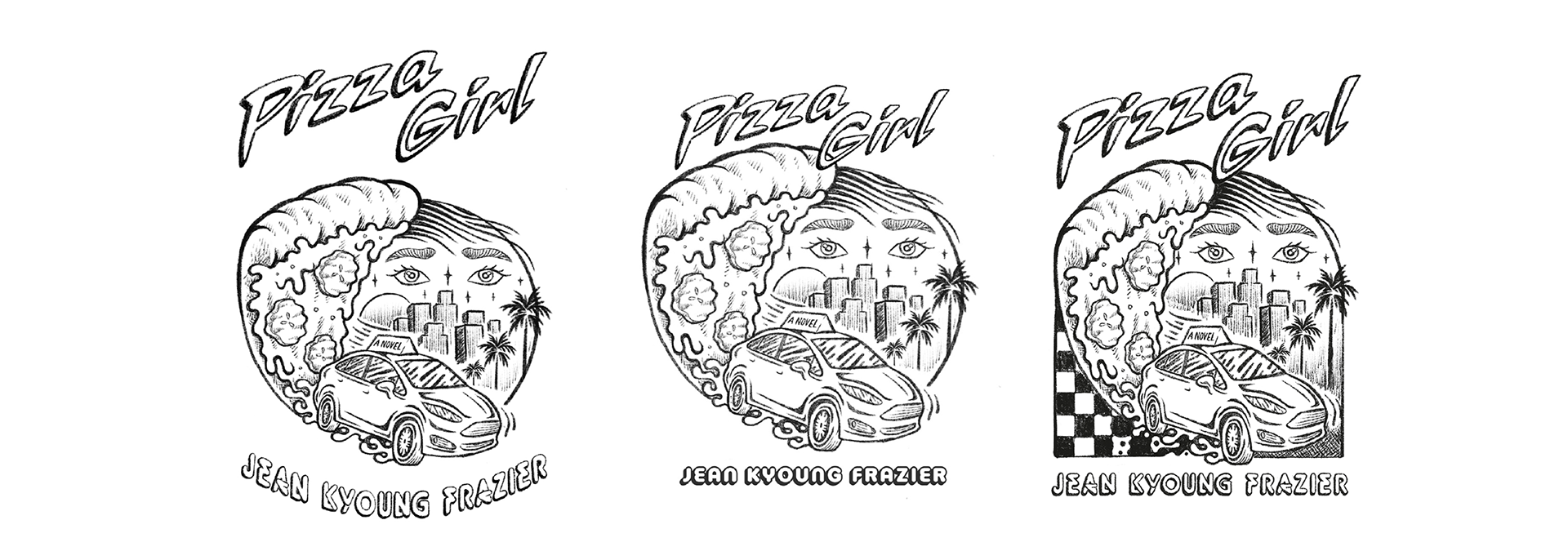
Was there a clear working process that led to the final?
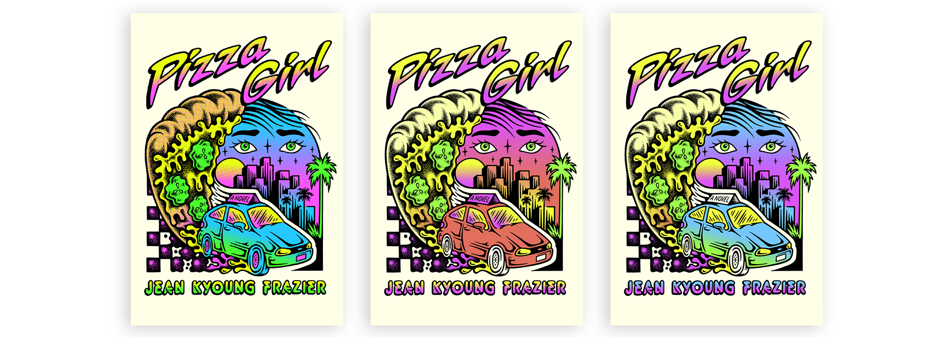
Yes! Tallboy gave us some amazing options. I had to push to make the type and image more integrated, and gave some suggestions about the overall shape and proportions of the art. He had also given us a few color palette options and we chose one that seemed to work best for the content of the book. I ended up taking out some gradients and simplifying the colors for the final art.
One of the problems I had with this particular cover was getting the neon colors to read on screen. It’s impossible to achieve the same color in a digital file as you would with flat printed neon inks, so it took a lot of convincing along the way that this would really pop much more than what we were seeing on the computer!
Sketches and color variations for Pizza Girl:
Did the project have any unique struggles?
Obviously not just limited to this job, but since I’ve been working from home, I haven’t seen one finished jacket. This was the last job that I saw proofs for. Since this was a special 6-color job (4 neons, the background off-white color, and black) with spot gloss uv, I was able to have the proofs sent to me when the pandemic hit. I did end up needing to adjust the opacity of the background color at that point, which was feeling too heavy. I never saw the final book, nor have I been sent any proofs (or finished books) since this project. These days I’m just relying on experience and faith that things print as I’ve envisioned them!

Emily Mahon, a Philadelphia native, studied at Penn State before making her way to New York. She began her career at Picador Books, and is currently an Art Director at Knopf Doubleday. She has been honored with awards from AIGA, The Type Director's Club, The Art Director’s Club and The New York Book Show. Emily has designed covers for award-winning authors, including Mark Haddon, Liane Moriarty, Colum McCann, David Eagleman, and Stacey Abrams. Emily also has her own freelance studio, working on wine labels and identity design in addition to book cover projects.
In her free time, she enjoys being outdoors with her husband and kids, playing soccer, and (in a normal year) hearing lots of live music!