
Police A Field Guide
Author: David Correia and Tyler Wall
Designer: Matt Avery
Art Director: Andy Pressman
Illustrator: Lauren Nassef
Publisher: Verso
Designer: Matt Avery
Art Director: Andy Pressman
Illustrator: Lauren Nassef
Publisher: Verso
What is this book about?
From the publisher:
Police: A Field Guide is an illustrated handbook to the methods, mythologies, and history that animate today’s police. It is a survival manual for encounters with cops and police logic, whether it arrives in the shape of officer friendly, Tasers, curfews, non-compliance, or reformist discourses about so-called bad apples. In a series of short chapters, each focusing on a single term, such as the beat, order, badge, throw-down weapon, and much more, authors David Correia and Tyler Wall present a guide that reinvents and demystifies the language of policing in order to better prepare activists—and anyone with an open mind—on one of the key issues of our time: police brutality. In doing so, they begin to chart a future free of this violence—and of police.
What is the genre / audience?
Non-fiction/Politics
Where is the image from?
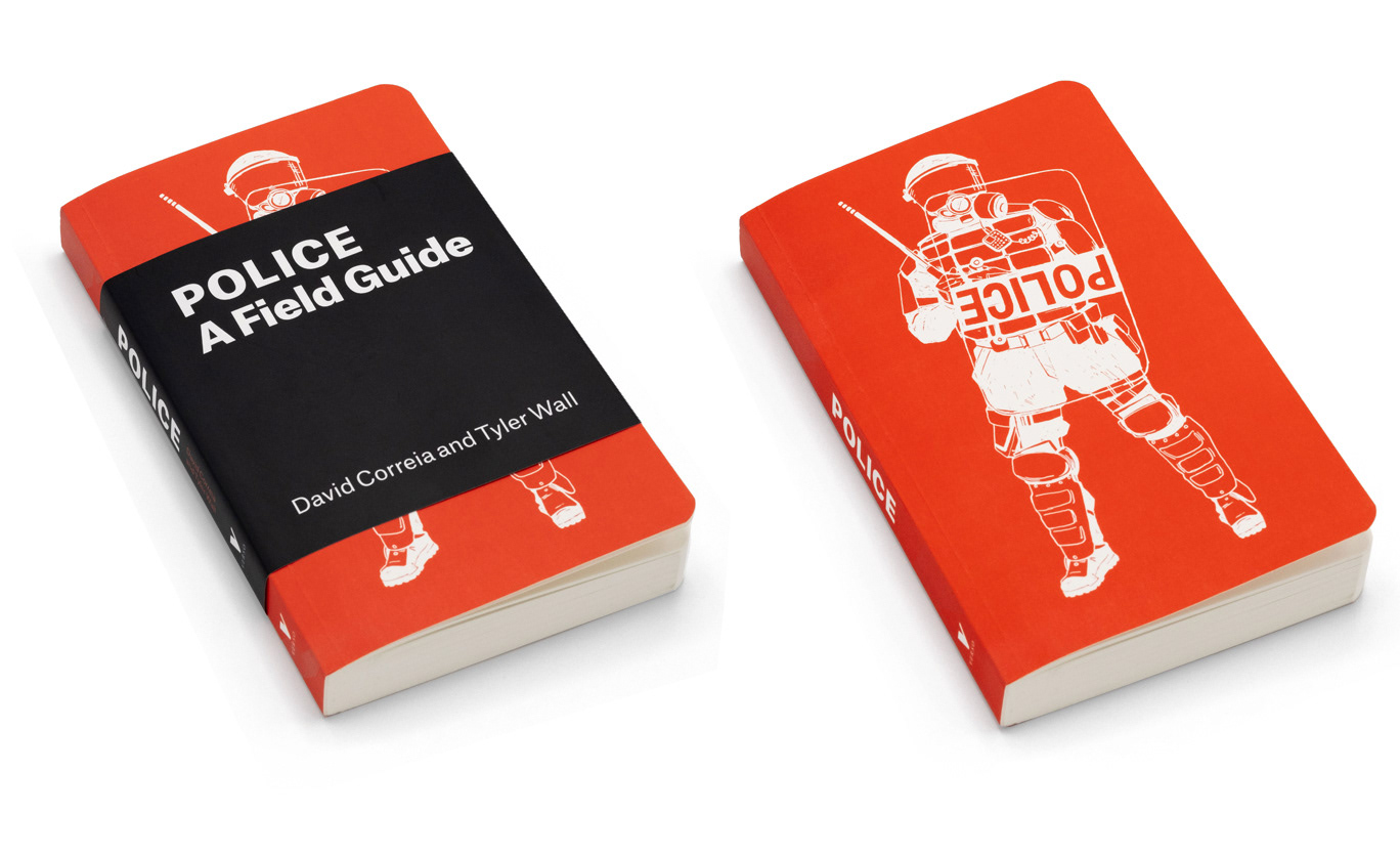
We were lucky to work with illustrator Lauren Nassef who created the cover art. As I remember it, Lauren said she took inspiration for the upside-down police shield from a photograph she came across during her research. Lauren’s talent in being able to draw true-to-life made her a perfect fit for this “field guide”—stylistically speaking—but above that her ability to imbue her artwork with meaning was an important contribution to supporting the argument this book makes.
Can you share your process?
The process was very collaborative. The idea of fashioning this after a field guide originated from the publisher / Andy Pressman (Verso’s art director at the time) and of course stems from the title itself. The iconic Audubon series, with the ¾ jackets and rounded corners, served as a model in terms of production. It was important, though, that this approach didn’t come off as a glib or gimmicky parody as the book is serious and not at all light-hearted. Rather, the concept of the field guide is meant to convey that the book is designed to be useful and can be navigated and read as a reference book—not necessarily from start to finish. The whole book was approached this way and the interior design has key terms and cross-references in a bold second color as well as additional illustrations by Lauren Nassef. Some things, like the rounded corners and two-color interior, were a stretch for the budget but in the end the publisher was able to make it work.
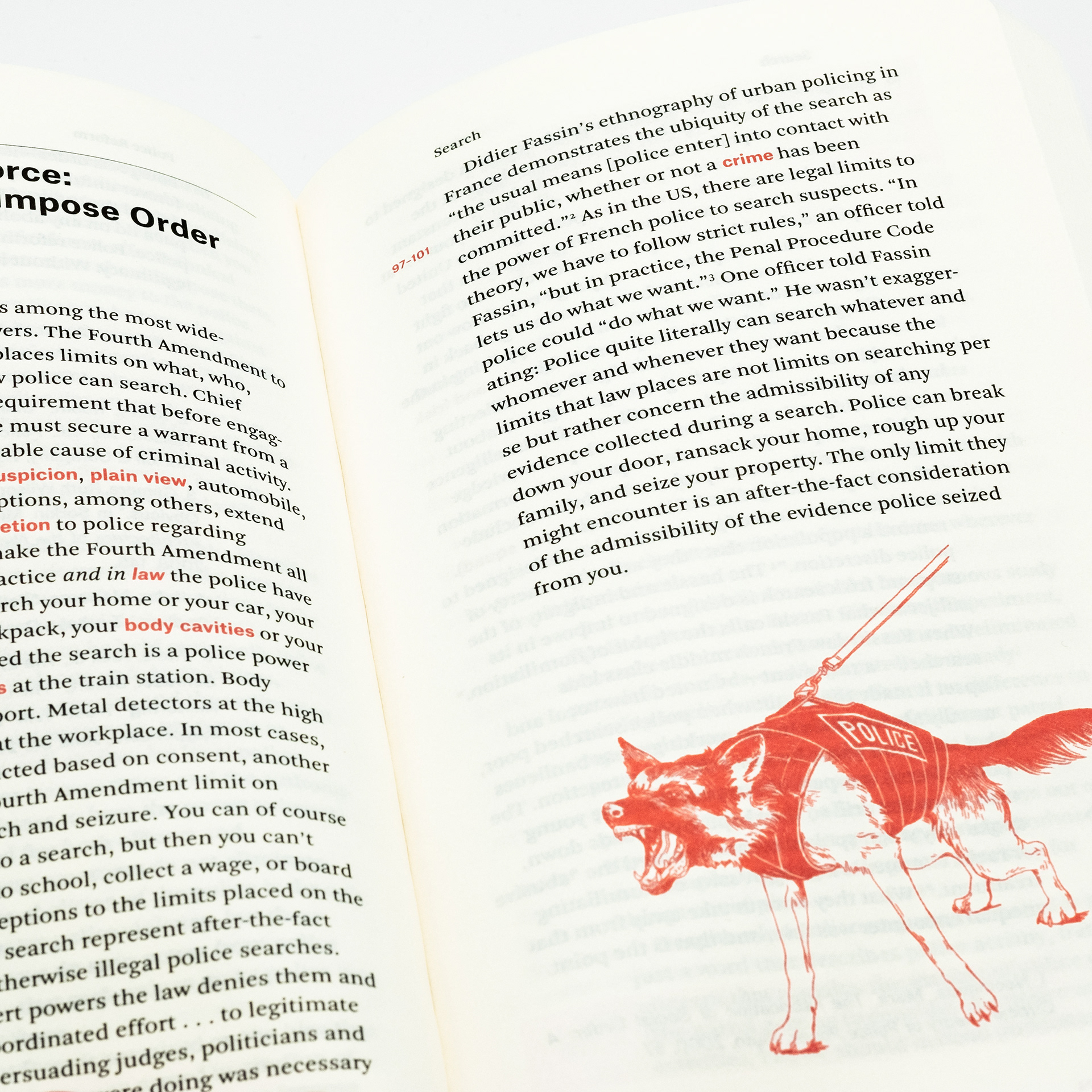
An example of the cross-references in the interior design and one of Lauren Nassef’s illustrations.
Were there any solutions outside the final you'd like to share?
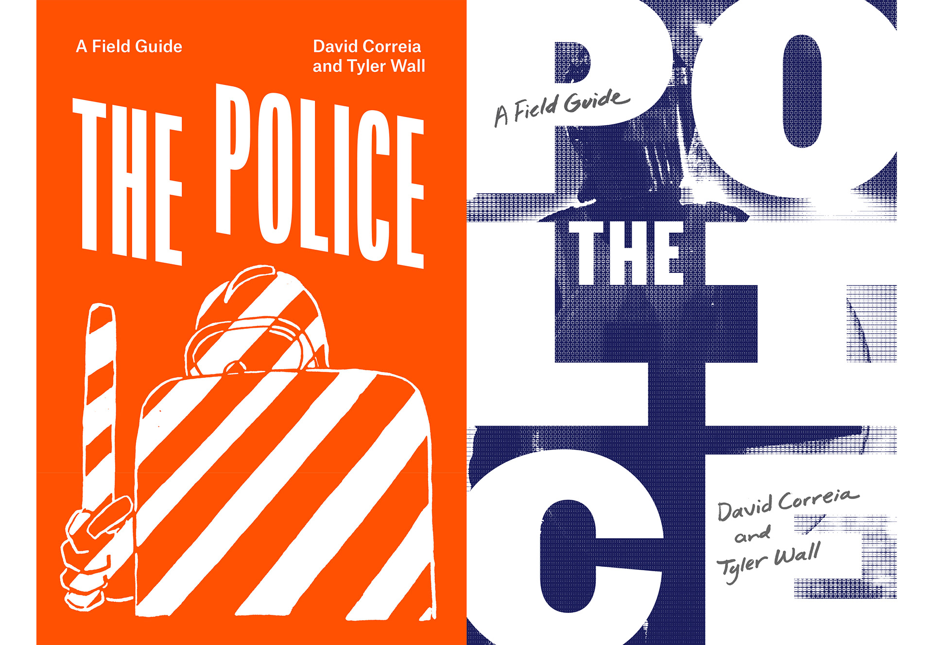
There were a few early proposals that don’t follow as closely the field guide look. For these I tried to create more of a mood or feeling to support this book’s critique of policing. The orange cover uses a Mai 68 image that seemed too specific of a European reference for this book’s audience. The use of photography on the blue cover drifted furthest away from the concept/look of a field guide. The badge cover is yet another direction we didn’t pursue.
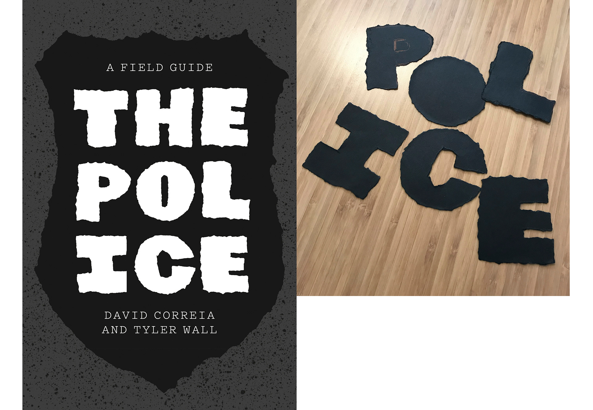
Torn letters made for the badge direction.
What typefaces were used?
Atlas Grotesk (cover and interior) and Arnhem Blond (interior).
What is the message behind the design?
This is such a critical moment in the U.S. where a real grappling with the role of police in our society is taking place. This reckoning is long overdue. I hope the design supports the message of the book which asks us to look beyond “police reforms” and question the very essence of policing.
Matt Avery is the founder of the design studio Monograph. Previously, he worked at the University of Chicago Press for fourteen years where as Principal Designer he was responsible for the 17th edition of The Chicago Manual of Style. His work has been recognized by 50 books | 50 covers, Communication Arts Typography Annual, Design Museum of Chicago, the Type Director’s Club, Print, The Society of Typographic Arts, AUP, and the Chicago Book Clinic. Living in Chicago with his wife and two children, he enjoys making collages and helping to plant and care for the city’s trees.