
The Night Guest
Author: Fiona McFarlane
Designer/Art Direction: Charlotte Strick
Illustrator: Ariana Nehmad Ross
Publisher: Farrar, Straus and Giroux
Designer/Art Direction: Charlotte Strick
Illustrator: Ariana Nehmad Ross
Publisher: Farrar, Straus and Giroux
What is the book about?
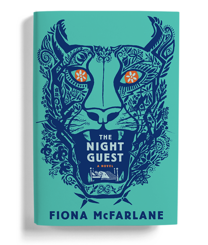
The protagonist a recently widowed septuagenarian named Ruth, who lives alone in a remote house perched above the sea. Her two grown sons live far away, and she’s grown quite lonesome and fragile. One day a persuasive stranger named Frida comes knocking; she claims to be a social worker for in-home, government-based eldercare program. Ruth, who is rightly confused and politely suspicious, all too quickly comes to rely on the caseworker’s company, despite her better judgment. In truth, Frida is both shrewd and brutish, and she takes full advantage of elderly woman’s vulnerabilities; a war of truths and lies ensues.Ruth, the daughter of missionaries, lived in Fiji as a young girl, and she spends a good deal of time reflecting on the lushness of that earlier life. She foolishly shares a recurrent fear with Frida that a jungle tiger is pacing around outside their house—desperate to claw its way inside. Frida manipulates this illusion to such extremes that the reader is left to wonder if Ruth might actually be right about the massive, prowling cat. Who will win this complex mind-game is anyone’s guess, as Ruth is not completely powerless!
What is the Genre/Audience?
Lovers of fiction and literary thrillers.
How did you find the illustrator?
I had started reading the manuscript for Fiona McFarlane’s novel, and the cover illustration was already so clear in my mind. Ariana was working with my husband at a commercial ad agency at the time and asked him if he would share her illustration portfolio with me. Her beautiful drawing of a bear, though stylistically different, told me she could pull off the hidden Fijian tiger I was imagining. What good timing for us both!
Can you share your process?
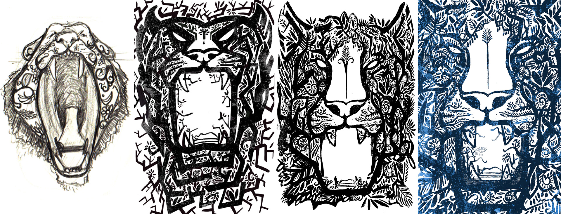
I shared a thumbnail sketch of my idea with Ariana. It was incredibly rough, but she understood right away what I was imagining and dove right in. It turned out that she’d recently had a dream about a slumbering lion that had really affected her, and she was moved by Ruth’s search for inner strength.
I asked her to research indigenous Fijian art that we could then use as inspiration to build the details of tiger’s face. I wanted it to have an outsider-artist quality. The angle was especially important as I needed the mouth to be opened wide enough for the type to fit inside, but also sufficiently closed for the reader to be able to make out its eyes, nose, and whiskers—details that I hoped would draw people in. Rounds of sketches were labored over to make sure the face was convincingly strong and feline, but not utterly terrifying. We worked hard to make sure the tiger didn’t just look like a horned devil! I wanted Ruth’s tiny bed, wedged between its teeth, to be a surprise discovery for readers, but because of the scale shifts, Ariana and I found the bed was easily swallowed up by the lushly, ornamental tiger. Finishing touches included adding details to the headboard and a patterned quilt, in an effort to draw a bit more attention to the novel’s homebound heroine.
Were there any specials on the printed piece?
We used copper foil stamping (on uncoated stock) to create the illusion of reflective feline eyes. Around the time of publication, back in 2013, a co-worker told me that one evening he’d been the last to leave the office, and as he turned back to flip the light switch, all he could see were rows and rows of bronze-colored tiger eyes shining out at him from the shadows.
What typeface was used?
Berliner Grotesk.

Charlotte Strick is a principal at the award-winning, multidisciplinary, Brooklyn based design firm, Strick&Williams. Founded in 2014 with her longtime friend and colleague, Claire Williams
Martinez, the studio collaborates with cultural clients and mission driven institutions in the arts, publishing, and education, such as Columbia University, MoMA, Lincoln Center Theater, London’s Royal Academy, and Human Rights Watch. For fourteen years prior to opening the studio, Strick was a designer turned Art Director at Farrar, Straus and Giroux, where she designed book covers for much-loved authors like Roberto Bolaño, Lydia Davis, and Jonathan Franzen. The proud owner of a coveted Silver Cube from the Art Directors Club, Charlotte is also the Art Editor of the prestigious Paris Review magazine, designed by the studio. Her writings on art and design have appeared in The Atlantic, The Huffington Post and The Paris Review.
Martinez, the studio collaborates with cultural clients and mission driven institutions in the arts, publishing, and education, such as Columbia University, MoMA, Lincoln Center Theater, London’s Royal Academy, and Human Rights Watch. For fourteen years prior to opening the studio, Strick was a designer turned Art Director at Farrar, Straus and Giroux, where she designed book covers for much-loved authors like Roberto Bolaño, Lydia Davis, and Jonathan Franzen. The proud owner of a coveted Silver Cube from the Art Directors Club, Charlotte is also the Art Editor of the prestigious Paris Review magazine, designed by the studio. Her writings on art and design have appeared in The Atlantic, The Huffington Post and The Paris Review.